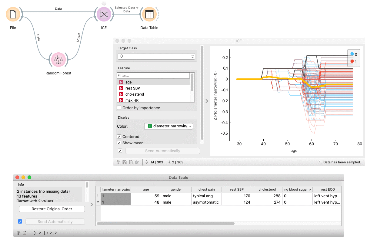
ICE
Displays one line per instance that shows how the instance’s prediction changes when a feature changes.
Inputs
Model: model
Data: dataset
Outputs
Selected Data: instances selected from the plot
Data: data with an additional column showing whether a point is selected
The ICE (Individual Conditional Expectation) widget visualizes the dependence of the prediction on a feature for each instance separately, resulting in one line per instance, compared to one line overall in partial dependence plots.
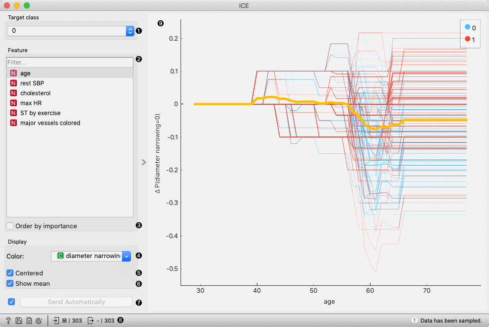
Select a target class.
Select a feature.
Order features by importance (partial dependence averaged across all the samples).
Apply the color of a discrete feature.
If Centered is ticked, the plot lines will start at the origin of the y-axis.
If Show mean is ticked, the average across all the samples in the dataset is shown.
If Send Automatically is ticked, the output is sent automatically after any change. Alternatively, click Send.
Get help, save the plot, make the report, set plot properties, or observe the size of input and output data.
Plot shows a line for each instance in the input dataset.
An interactive plot. Each line represents an instance in the dataset. To select a line, click and drag a line over it.
Example
In the following example, we use the ICE widget to explain a Random Forest model. In the File widget, we open the housing dataset. We connect it to the Random Forest widget, which trains the model. The ICE widget accepts the model and data which are used to explain the model.
By selecting some arbitrary lines, the selected instances of the input dataset appear on the output of the ICE widget.